Using Visual Storytelling to Spread Scientific Awareness

Storytelling as we know is a very powerful tool used to communicate messages through different forms of media and messaging. However, some may think visual storytelling is mostly used in just entertainment, advertising and social media. Storytelling is used in all fields and industries when you think about it, including the field of science. Scientific storytelling usually will be a mix of strong evidence-based data and statistics, along with a compelling message to evoke emotion and understanding of the topic. It can be complex, and targeted at science professionals, or aim to target the public about certain negative issues that are happening in the world.
A common form of visual storytelling includes infographics. You do not need to be a graphic designer to make an infographic either, there are thousands of great examples or tips online. I like “The Complete Guide to Designing Stunning Visual Content” by Neil Patel. He states “The best part is that there’s no graphic design experience needed to create stunning, share-worthy images. You can simply drag and drop the elements you want to get surprisingly good results.” I used his tips and tricks when designing my own infographic on a scientific topic. I’ll talk more about that later in the blog.
Understanding Scientific Visual Storytelling
Scientific storytelling turns data and statistics into relatable, and even emotional connections. As described in a research paper by Estrada and Davis, they state “Visual representation of science information can include a diversity of styles and techniques such as highly literal imagery, abstract images, diagrams, symbolic notations, and infographics (data visualizations) among others.”
Similar statements are echoed by Bill Dennison in his research article on practical visual literacy in science communications. Dennison highlights that “the layout of a science communication product can be enhanced by mocking up a design in which text and visual elements are laid out as they will appear in the final product.” Infographics are a strong and effective communication tool that focus on topics that usually have a CTA within them. Oftentimes they help raise awareness on different topics to help educate users.
Plastic Pollution Scientific Storytelling
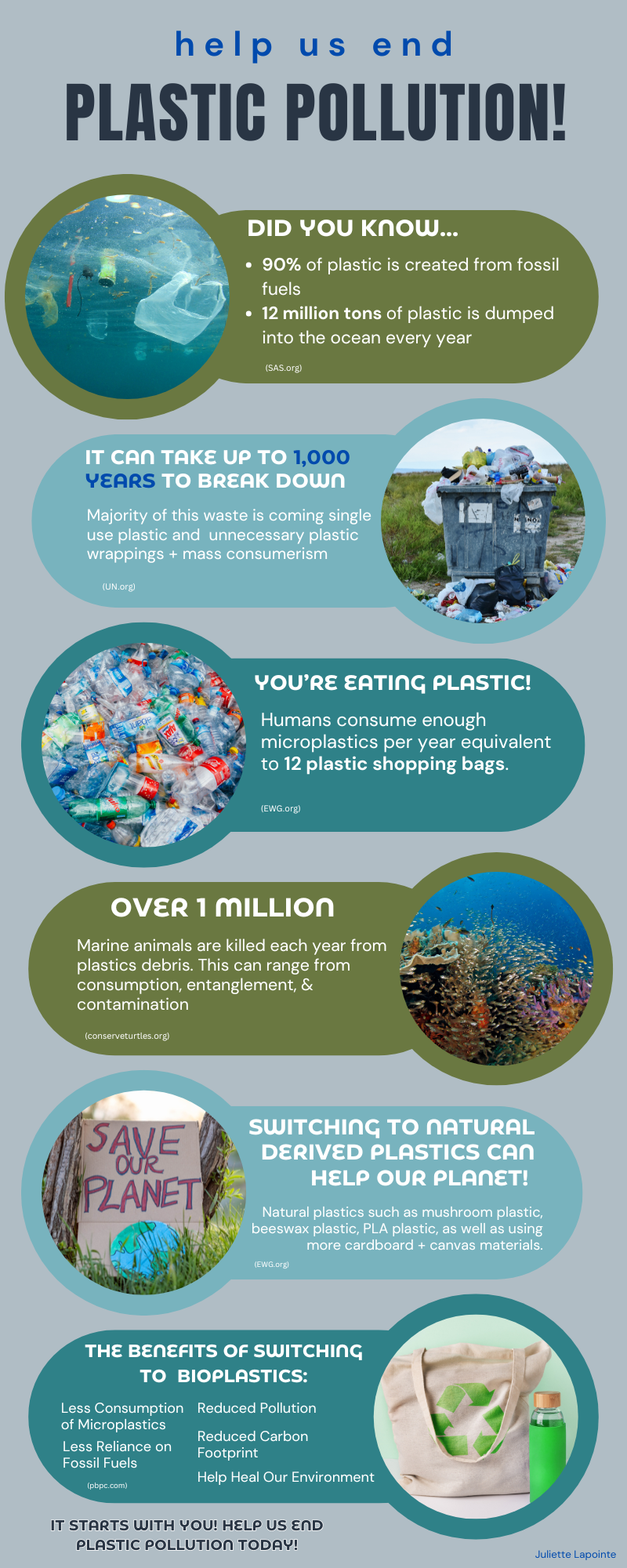
In regard to this topic, I chose one of the many science based social topics I am interested in to create an engaging visual infographic. By taking tips and learning from the research papers on science storytelling, I created the infographic below on the plastic pollution problem, that scientists and environmentalists have been warning people about for many years. When designing this document, I used Canva to create it and applied many new skills I have learned about principles of storytelling.
Infographic Research Work Cited:
Information About Sea Turtles: Threats from Marine Debris. Sea Turtle Conservancy. (2021, September 2). https://conserveturtles.org/information-sea-turtles-threats-marine-debris/#:~:text=The%20Problem%3A%20Over%201%20million,in%20oceans%20around%20the%20world.
McNamara, S. (2024, October 3). The Diverse Uses of Bioplastics. Plant Based Products Council. https://pbpc.com/diverse-uses-of-bioplastics/
Plastic Pollution: Facts & Figures. Surfers Against Sewage. (n.d.). https://www.sas.org.uk/plastic-pollution/plastic-pollution-facts-figures/
Subramaniam, V. (2024, September 18). The invisible threat: EWG analysis shows you could be eating as many as 12 plastic bags a year | environmental Working Group. EWG. https://www.ewg.org/research/invisible-threat-ewg-analysis-shows-you-could-be-eating-many-12-plastic-bags-year
UNEP. (2023, June 5). Understanding Plastic Pollution and its Impact on Lives | Africa Renewal. United Nations. https://www.un.org/africarenewal/magazine/may-2023/understanding-plastic-pollution-and-its-impact-lives#:~:text=Unlike%20other%20materials%2C%20plastic%20does,can%20cause%20serious%20health%20impacts.
5 Ecofriendly & Biodegradable Alternatives to Plastic. Plastic Polluters. (2022, December 8). https://plasticpolluters.org/alternatives-to-plastic/
Blog Post Work Cited:
Clark-Keane, C. (2017, February 26). 8 Ways to Use Color Psychology in Marketing (with examples) . WordStream . https://www.wordstream.com/blog/ws/2022/07/12/color-psychology-marketing (Module 3)
Dennison, B. (2017, March 28). Practical Visual Literacy for Science Communication: Blog. UMCES. https://ian.umces.edu/blog/practical-visual-literacy-for-science-communication/ (Module 6)
Estrada, F. C. R., & Davis, L. S. (2014, December 26). Improving Visual Communication of Science Through the Incorporation of Graphic Design Theories and Practices into Science Communication. Sage Journals. https://www.researchgate.net/publication/271516036_Improving_Visual_Communication_of_Science_Through_the_Incorporation_of_Graphic_Design_Theories_and_Practices_Into_Science_Communication (Module 6)
Marquez, A. (2017, November 1). Introduction to Multi-Sensory Design. Introduction to Multi-sensory Design. https://www.aknamarquez.com/blog/2017/7/23/what-is-multi-sensory-design (Module 5)
Patel, N. (n.d.). The Complete Guide to designing stunning visual content (even if you’re not a graphic artist). NP Digital. https://neilpatel.com/blog/the-complete-guide-to-designing-visually-stunning-content-even-if-youre-not-a-graphic-artist/ (Module 6)
5 Storytelling Secrets for Creating Images that Connect. Yotpo. (2024, January 7). https://www.yotpo.com/resources/5-visual-storytelling-secrets-to-improve-your-marketing-images/ (Module 7)